Reactstorm
November 30, 2019
I have a tendency to indulge in nostalgia perhaps a bit more than some would consider normal. But i figured I could improve my web development skills at the same time it would be easier to justify it.. to my self..
So Im planing on taking websites that i enjoyed and have a very fond memory of from my youth and recreate them using modern web technologies.
First up, lunarstorm
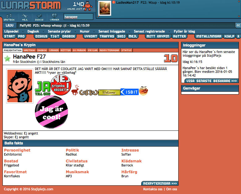
lunarstorm was a socialnetwork in sweden most active in the early 2000s. I wasnt that active on it but I did have an account. I remember playing robotwars on a flash site and chatting to people on lunarstorm, good times.
I do think the aestetichs for lack of better word still has something,
 Pretty slick right ?
This site used table for layout and images for the rest, as was the standard back then, but the web has improved alot since then, so maybe we can do better. lets give it a shot.
Styling
instead of using images for everything we can create the gradients and border radiuses using only css properties such ass
- repeating-linear-gradient, we can use this to create the
LAJVblock that has a “scanline” look. - linear-gradient, to create a general
Boxcomponent, with the blue gradient and a light top border.
Layout
Layouting is done using flexbox and grid, thank god no more tables. the one part that gave me some problems was the iregular cutout under the logo, but with some css pseudo elements i managed to create a shim.
Logo and fonts
I found a free font for the logo called Outage by Dave Whitley, its very close to the original, which I suspect was custom drawn.
the pixel font was another hard one, the closest I could find was VT323 on google fonts, but its a bit taller than what was used originaly, so I used transform scaleY to squish the font a bit